
Drawn Onward. A Back to Front to Back Tale of Hopelessness and Hope
Fremantle Press, 2017
Writer: Meg McKinley
Critics are bone-cracking omnivores. As a rule, the more there is to consume, the better to whet sharp incisors, and there are more bits to pick from our teeth. Drawn Onward, A Back to Front to Back Tale of Hopelessness and Hope, a comic written by Australian Meg McKinley, is, however, an atypical diet.
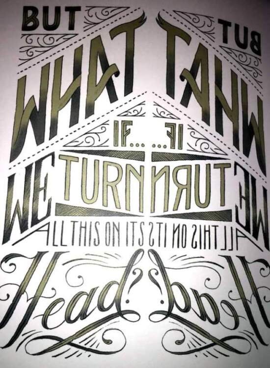
As a work of art, Drawn Onward is a remarkable text. The entire story has a palindrome built into the sentence structure. Thus, in the first half of the book:
There is no light on the horizon and it is foolish to think you can change anything at all
becomes this in the second half of the book:
You can change anything at all. It is foolish to think there is no light on
the horizon.
It is obviously not a true palindrome. It is more palindrome in meaning that in traditional letter placement. This is nonetheless the first time we have encountered even a pseudo-palindromic comic book. Palindromes have a long history. As noted on this website:
Palindromes as a form of wordplay have been created for many centuries. For example, the ancient Greeks are known to have often inscribed the following onto their fountains:
Nipson anomemata me monan opsin.
It translates as wash the sin as well as the face. Sharp-eyed readers will notice that the above it not actually a palindrome. This is because we have written it using letters of the English alphabet; when Greek characters are used it is a palindrome because ps is a single letter in Greek (Y).
The Romans were also admirers of palindromes, and produced such sentences as:
In girum imus nocte et consumimur igni.
It means we enter the circle after dark and are consumed by fire and is said to describe the movement of moths.
(For a very modern and fun analysis, please follow this link to a 2015 article published in Time magazine.)
Turning back to Drawn Onward, judicial applications of sentence periods break up the text so as to reorder the meaning. The front of the book is rendered in dark greys. The rear of the text is painted in greens. It is extremely clever and displays a meticulous attention to structure by Ms McKinley.
The transition point incorporates both colours:
The comic is relentlessly buoyant notwithstanding its evenly balanced title. But while it is a few steps above a series of inspirational bumper stickers, it is more form over substance. As your reviewer’s fifteen year old daughter observed with a smile, “It is cute”, and perhaps, to be fair, teens are the target demographic market. But there is no meat on the bone. We feel like we are clashing our teeth at a butterfly.